
Time for some publicity
I did promise this to him a little while ago, and now it's time to put the butter on the bread. Let me start at the beginning.
I've been a photographer for quite some time. I know all there is to know about making a good photograph, and I know all about lighting outside and in the studio using flashes and softboxes. There's one thing though, that I didn't manage to get my head around without some help.
More in particular: using light modifiers (read: reflectors).
So I decided to follow a workshop organized by someone we may call an authority on the subject. Professionally, he shoots a lot of children's fashion for several brands, but in his spare time he is more eager to share his skill and knowledge than anyone I've ever known. He's a great photographer, a fantastic teacher and entertainer, but above all, he's a truly nice character.
His name is Tom Museeuw, and I bid you to have a look on his website and be amazed by the great pictures, most of which I know have been taken using reflectors.
the Create That Light Workshop starts with theory and practical examples. It's aimed at the advanced photographer, who doesn't need to be explained what the reverse square law means to photography and lighting the scene, just to name one thing.
After a few hours of that, the whole bunch goes out, using Tom's California Sunbouce reflectors and they'll start putting the theory to practice.


I can only say that this was probably the most useful workshop I've every had. I will most definitely get one or two reflectors for myself, as it enhances the quality of portraits in a dramatic way, at least if you have light to bounce of course.
Since the proof is in the pudding, here's one picture that will show you how eyes get enhanced in a way I don't get to see so often with flash. Other than converting it to black-and-white, I hardly needed to do any post processing either, which is a blessing for my workflow. If you click on the picture, you'll be taken to the gallery with more great shots.

Thanks Tom. I'm truly blessed for knowing you!
The word I hate most: pixelpeeping!
Pixelpeeping. To me it's an illness that came with the digital era. Wherever you look, people with nifty cameras and even niftier lenses are glued to their supersized screens, blowing up pictures for full-size viewing, examining the pixels. It drove me nuts in the past, and it drives me nuts today. I have rarely had any valuable feedback to my work when I asked for feedback. "Not in focus", "noisy", "I see a little motion blur", "there's a spot of blown-out white there". Well thanks, but who cares? I want to know what you think about the artistic quality. Uhm... the WHAT? Yeah, never mind.

The pixels, that's what is examined, not the big picture, and I mean that in the literal sense of the word. Why am I saying that? Well, because photography is not about analyzing pixels. It's about looking at the photograph as something that has meaning, not as something that has twenty million pixels.
Where are the days when photographers debated long hours about the artistic value of a photograph, more often than not over a pint of beer or a glass of brandy? If there was little light, you used a high sensitivity film, and you had grain. There was no way around it. And sometimes also motion blur, and there was no way around that either. But all that did not matter, because what ultimately counted, was the meaning your would attribute to the photograph.
Today however, I distinguish two types of people, who both have a camera: the photographer, and the camera owner.
The photographer sees his or her camera as a means to an end. If it breaks down, then a compact camera will also do the job if needed in certain scenarios. The photographer will try to provide the best possible image quality, but there are limits, and so be it. If the message is conveyed, the photographer is a happy camper.
The camera owner mostly cares about the technical quality of the image. Noise is not good, motion blur is not good, overexposure is a no-no, because you can avoid it with the red blinking areas in Adobe Lightroom, and the blue blinkers allow you to eliminate those two pixels of pure black. True, all that. But don't ask them to provide an insight in what the photograph means to them. It often doesn't have a meaning, as they don't have the first clue of how to make expressive photographs.
I know I'm being black-and-white here. There's a grey zone, where you're not expected to give meaning to pictures, and where pixel perfect quality is required. The fashion industry is testimony to it. Colors have to be spot on, no blown-out white allowed, and it's only logical. Most commercial photography is like that.
But when we enter the world of photographic art, like street photography or conceptual photography, seldomly commercial, then I find my opinions to be valid.
I have yet to find the first photography club where photographs are actually debated over for their artistic quality, rather than pixel quality.
What do YOU think about it?
Even een paar ontzettend goeie fotografen promoten
Zoals elke fotograaf, heb ik ook mijn idolen. Het verschil tussen mij en de meeste anderen is dat mijn idolen niet dood zijn. Ja, ik bewonder Ansel Adams, Henri Cartier-Bresson en nog wat anderen, maar ze zijn dood, en ik kan met hen niet van gedachten wisselen.
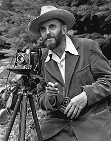

Geef mij maar levende zielen. Mensen die één geheel vormen met hun werk. Ze fotograferen zoals ze zijn, en ik kan ze bedanken voor de inspiratie die ze mij geven.
Zo heb je bijvoorbeeld Ashvin. Ik ken hem al eeuwen, al heb ik hem nog nooit ontmoet. Hij is een ontzettend getalenteerde huwelijksfotograaf met nog zoveel andere passies in zijn leven, zoals zijn papegaaien, zijn plantjes, zijn kickboksschool en zijn liefde voor mensen. Hij is dankbaar voor elk klein ding in zijn leven. Waren er maar meer zoals hij. Hij wint aan de lopende band internationale prijzen voor zijn foto's, en het lijkt wel of hij het bij elke prijs niet kan geloven. Bescheiden, getalenteerd, en een ontzettend fijne kerel. Bekijk zijn werk hier.
Nummer twee is een Roemeense tandarts. Uit Transsylvanië, misschien wel verre familie van graaf Dracul, wie weet! Ze heet Crina Prida, en ik ken haar ook al minstens tien jaar.
Ze heeft al vaak tentoonstellingen gedaan. Ze heeft een stijl die ik tussen duizend foto's zou herkennen. Heel conceptueel, en een perfecte weergave van hoe ze is. Het is me ook een raadsel hoe ze aan al die prachtige vrouwen komt, die voor haar lens verschijnen. Ik denk niet dat ik ooit een foto van haar heb gezien die ik niet mooi vond. Haar werk vind je hier.
In een volgende post ga ik het eens hebben over mijn stijl. Hoe die ontstaan is, hoe die blijft evolueren en hoe ik eraan blijf finetunen. En dan wil ik daar wel eens jullie gedachten over horen. Maar dat is voor over een paar dagen!
Nieuw bij Vue: workshop initiatie fotografie
Zoals velen onder jullie wel weten, fotografeer ik al vele jaren, zelfs van toen er van digitale fotografie nog geen sprake was.
Ik ben in al die tijd heel gretig blijven leren, en ben dus thuis in alle mogelijke takken van de fotografie.
Ik doe veel schoolfoto's, communies en studioportretten, maar mijn passie gaat uit naar podiumkunsten, kinderen, straatfotografie als kunstvorm, en andere vormen, waar je je creativiteit echt tot uiting kan laten komen.
Zo ben ik de huisfotograaf van een toneelgroep, verkoop ik mijn straatfoto's aan welgestelde klanten in de Verenigde Staten, heb ik geregeld shoots met modellen in de studio, maar ook in stedelijke omgevingen, en heb ik samenwerkingen met uitgeverijen, waar je een heel boek in één coverfoto moet kunnen vatten. Ik specialiseer mij verder in expressieve fotografie, waar ik een hele theorie door ontwikkeld heb, op basis van mijn Amerikaanse mentor, die tot zijn pensioen expressieve fotografie heeft onderwezen.
Ik vond dus dat het tijd werd dat ik mijn kennis begon te delen. Een simpele rondvraag in mijn omgeving toonde aan dat er veel vraag is naar een begrijpelijke workshop voor mensen die hun foto's naar een hoger niveau willen tillen. Een avondcursus fotografie is echter niet iets waar veel mensen op zitten te wachten. Het duurt lang, is relatief duur, en je hebt geen boodschap aan de geschiedenis van de fotografie, om maar iets te zeggen. Je wil gewoon betere foto's maken.
En daar gaan we dus voor. Hoe kan ik ook anders, met zoveel gemotiveerde kandidaten?
Voor de maanden mei/juni ga ik een workshop van een dag uitwerken, waarbij je leert hoe een fototoestel beelden vastlegt, welke parameters daarbij belangrijk zijn, wat die parameters doen, en hoe ze onderling met elkaar in verband staan. Als je dat weet, dan weet je ook welk effect dat heeft op je beeld, en waarom foto's soms goed zijn, maar vaak ook te donker, te licht, te korrelig of bewogen, terwijl je dat niet wil. En dan heb je de basis om altijd te weten wat je moet doen om steeds een prima foto te maken.
Ik zal het tonen aan de hand van voorbeelden, heel praktisch dus. Een beetje theorie, maar daarna gaan we dat allemaal in de praktijk toepassen. We zullen foto's nemen zoals je dat altijd deed, en dan laat ik je zien waarom je onderwerp soms gewoon veel te donker of bewogen is, én hoe je ervoor zorgt dat het in het vervolg beter gaat.
Wil je op de hoogte blijven van wanneer dit doorgaat en hoe je je kan registreren, laat dan je e-mailadres achter om de nieuwsbrief te ontvangen. Alles zal daarin uitgelegd worden: waar, wanneer, de indeling van de dag, enzovoort.
Klik hier om je op de nieuwsbrief in te schrijven.
Bij verdere vragen kan je me ook mailen op [email protected] .
Tot binnenkort!
Jeroen
Expressive street photography: how do you do it?
To my own and humble opinion, there are two types of photographs when speaking about street photography: documentary photographs, and expressive photographs. The first will document what's going on in the streets, and they will show you what everybody else sees. Hang them on the wall, and people will maybe recognize where it was taken and then move on.
The second type, the expressive photographs, will make people think and look for deeper meaning. Hang one of those on a wall, and people will stop and talk about it.
What I'm about to tell you, is something I've learned from a great photographer and a great human being, Phil Douglis. Over the years, I've made my own version of his theory, but I cannot tell you how I create expressive photographs without mentioning this wonderful man, whose entire theory, complete with sample galleries, can be found here.
The very best expressive photographs contain three main elements: juxtaposition, incongruity and at least one expression of a human value.
Juxtaposition
As the word says, you will see two opposing elements in the photograph: dark/light, high/low, sad/happy... there are many possibilities, and if you look carefully, you will find opposing elements everywhere, and it's the easiest one to find. But it's not enough to make an expressive photograph.
Incongruity
Incongruous elements are a lot harder to find. You can find them, but that doesn't mean the incongruous situation lasts long enough for you to take that photograph, frame it well AND also have opposing elements and human value.
Incongruity could be a tree in the middle of a road, a car in the middle of a forest, or a cat in a fish tank.
Human values
Well, there are lots of those, and you don't necessarily need for a human to be in the frame in order to find human values, Love, hate, rage, anger, happiness, mourning, virtue, feelings, emotions... there's a lot to go around.

So, do you see the expressive value of the image above? The child is small, the mother is taller, and they are opposite each other. That's juxtaposition. The child is sitting on top of the stroller, that's inconguous, isn't it? And finally there's the love between the two, and that's a definite human value.
The fourth element comes to the rescue
Indeed, there's a fourth element, which is abstraction. The more abstraction you can add into the frame, the less strong your other elements need to be. So if all else fails: make it abstract! You can do that sometimes by converting to black and white, or by applying heavy contrast for instance, but sometimes the abstraction is right there in the frame. Repeating patterns, or the sun causing lense flare.
So where to find those expressive images?
Go have a look at the World Press Photo award winners. Just about all of them have the three, and sometimes all four elements in them.
There's one single image that I think shows all of this more clearly than any other image I've ever seen, and that's the photo made by Spencer Platt, which won the award in 2007. It features a shiny convertible car, filled with neatly dressed young Lebanese people, cell phones in hand and all, driving by a scene of devastation, caused by artillery, where people are digging through the rubble. It has juxtaposition in more than one way, incongruity is showing all over the frame, and opposing human values that cause the viewer to be ashamed. You can find that awesome image here.
